

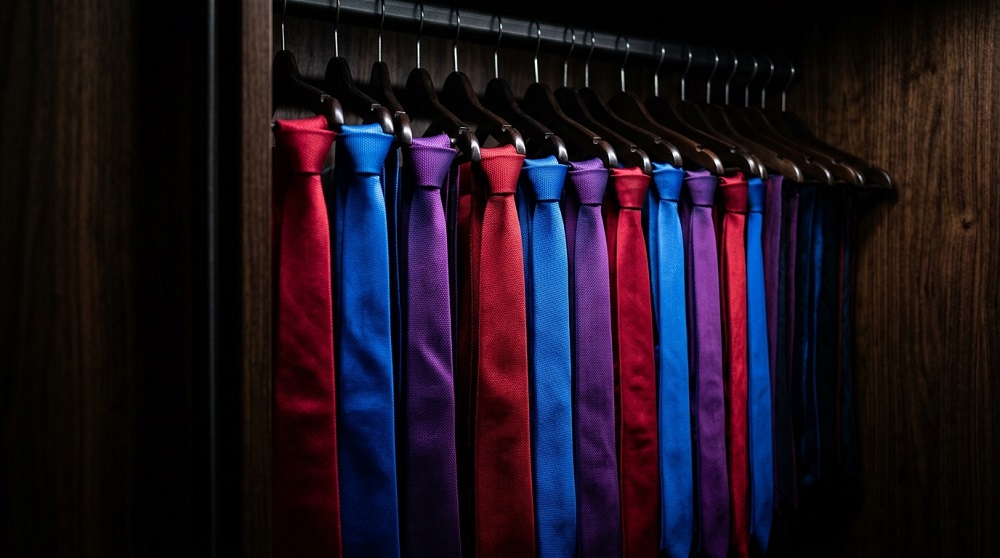
Color is one of the most powerful tools in building a wardrobe that feels distinctly yours, yet it’s often the most overlooked. Choosing colors thoughtfully — based on your skin tone, personal style, and how pieces work together — can make your entire wardrobe feel more cohesive and intentional.
- Understand Your Undertone
- Identify Warm, Cool, or Neutral Undertones
- A Simple Way to Check
- Test Colors Near Your Face
- Build a Foundation With Neutrals
- Choose Neutrals That Suit You
- Use Neutrals as a Canvas
- Incorporate Color Thoughtfully
- Start With One Statement Color at a Time
- Learn Basic Color Coordination
- Consider the Occasion
- Let Personal Style Guide the Details
- Reflect Your Personality Through Color
- Pay Attention to What You’re Drawn To
- Avoid Common Color Mistakes
- Don’t Ignore Undertone Clashes
- Watch for Overly Matchy Combinations
- Final Thoughts
Understand Your Undertone
Identify Warm, Cool, or Neutral Undertones
Your skin’s undertone significantly affects which colors look most flattering against it. Warm undertones tend to suit earthy, golden, or warm-toned colors, while cool undertones often pair better with blues, purples, and jewel tones. Neutral undertones have more flexibility across both ranges.
A Simple Way to Check
Looking at the veins on your wrist can offer a quick clue — greenish veins often suggest warm undertones, while bluish or purplish veins suggest cool undertones. This isn’t a perfect science, but it’s a useful starting point for narrowing your color choices.
Test Colors Near Your Face
Holding different colored fabrics near your face in natural light reveals which tones brighten your complexion versus which ones wash you out. This simple test is often more reliable than any general rule of thumb.
Build a Foundation With Neutrals
Choose Neutrals That Suit You
Not all neutrals are created equal — some people look better in warm beige and camel tones, while others suit cooler grays and true blacks more naturally. Identifying which neutral family flatters you creates a stronger foundation for your wardrobe.
Use Neutrals as a Canvas
Building your core wardrobe around flattering neutrals gives you a flexible base that allows bolder colors to stand out as intentional accents, rather than getting lost in a chaotic mix.
Incorporate Color Thoughtfully
Start With One Statement Color at a Time
If you’re used to wearing mostly neutrals, introducing color gradually — through one accent piece per outfit — is an easier way to build confidence than overhauling your entire palette at once.
Learn Basic Color Coordination
Complementary colors (opposite each other on the color wheel) create bold, high-contrast looks, while analogous colors (next to each other) create a softer, more harmonious effect. Understanding these basic relationships makes color pairing far less intimidating.
Consider the Occasion
Bright, bold colors often work well for casual or creative settings, while muted or classic tones tend to suit professional environments. Adjusting color intensity based on context helps outfits feel appropriate as well as stylish.
Let Personal Style Guide the Details
Reflect Your Personality Through Color
Beyond flattering undertones, color choice is also a form of self-expression. Someone drawn to bold, saturated colors will build a very different wardrobe than someone who gravitates toward soft, muted tones — both are valid as long as they feel authentic to you.
Pay Attention to What You’re Drawn To
Notice which colors you consistently reach for or compliment you the most when wearing. Building your wardrobe around genuine preferences, rather than rules alone, results in a closet you’ll actually enjoy wearing.
Avoid Common Color Mistakes
Don’t Ignore Undertone Clashes
Wearing a color with an undertone that clashes with your skin can make you look tired or washed out, even if the color itself is trendy or appealing on someone else.
Watch for Overly Matchy Combinations
Pairing too many similar shades without variation can look flat. Mixing textures or adding a contrasting accent piece keeps color-coordinated outfits feeling intentional rather than one-dimensional.
Final Thoughts
Choosing the right clothing colors comes down to understanding your undertone, building a flattering neutral base, and layering in color thoughtfully based on both flattery and personal expression. With a bit of experimentation, color can become one of the easiest ways to make your wardrobe feel distinctly your own.